Three Secrets to Throwing a Killer Event


As a marketer, you know how important it is to foster positive brand awareness. It’s your job, after all. But with today’s asymmetrical media, your job is a little tougher. People are harder to reach — and fewer engage — so you have to pull out all the stops.
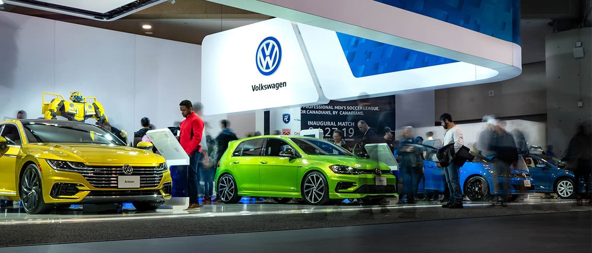
One powerful technique is event marketing. Done well, your live event can leave an enduring impression that helps your target customers fall head over heels for your brand. On the other hand, if your event is haphazardly executed, you’ll only end up leaving your attendees feeling sour.
As live events become a bigger part of consumers’ purchase decisions, reaching that harmonious balance between authentic engagement and brand-focused content becomes more and more important. Thankfully, your next event can yield a positive, engaging experience if it’s:
Strategic
From the front door to the finger food, the word “strategic” should resonate throughout every aspect of your event. Start with the planning process, making sure you know exactly where every marketing dollar is going. Minimize your budget for commodities and flashy items. Instead, ramp up spending on the experiential and iconic. After all, what do you think your attendees will remember more: fancy biscotti or a creative, interactive event they’ve never experienced?
The organization stage is where all the strategic magic happens. Establish a clear set of guiding and organizing principles. Every activity, piece of content, and focal point should resonate with corporate goals and the message your audience is hoping to hear. A strong strategy is at the heart of every great event.
Visual
When you’re designing an event, you’re simultaneously building a story, and the easiest way to tell a story is through visual imagery. Great visual events have a clear sense of priority. As you’re planning your event, think about what you want your attendees to see when they walk through the door. Should they be excited or have a sense of foreboding? Paint a picture for your attendees, and create a visual story with a beginning, middle, and end that will truly stir their emotions.
Creative visual cues and key landmarks also give attendees a memorable way to navigate your space. After all, “meet me by the large pink elephant” sounds way cooler than “meet me by booth 420B.”
Streamlined
Have you ever attended a conference where you felt just absolutely lost? Hundreds of people whir around you, everyone has places to go, and you’re just trying to find a conference room.
After creating a great strategy and visual dynamic for your event, why squander it with a confusing labyrinth of rooms? Consolidating venues and keeping things local allows more time to absorb valuable information and network. Create areas that have multiple uses (e.g., network in the keynote venue and serve snacks in an empty room). Get creative.
More than that, just put yourself in the place of your attendees. Would you want to walk half a mile to attend a talk? Would you need someone to point you in the right direction? Streamlined events flow naturally from one activity to the next, and clear navigational tools and a well-trained staff help make these transitions smooth.
For SAPPHIRE NOW 2014, the Sparks creative team worked with the SAP Events team to bring a strategic, streamlined, and highly visual event to life. To pull it off, we paid close attention to event feedback from previous years. One key thing attendees wanted was a less formal approach to keynote presentations, so we offered a range of commitments — from full-on theater-style seating to back-of-the-house standing room. Additionally, the show was broadcast live and was visible to everyone in the networking space and the entire event floor.
A distinct, consistent brand and content hierarchy was applied to all graphic elements throughout the event. From posters to wayfinding, everything fit within the brand, delivering a strategic, visual, and streamlined event that won the crowd over.


